The orange image was the one I wanted to keep: a shoelace had become a winding path. But the first output did not go into the finished pile. The lace meant to attract attention covered the shoe, while the path behind it had no clear connection. A promising idea had run into a surprisingly small, practical problem.
The starting point: just this one image
 Enlarge image
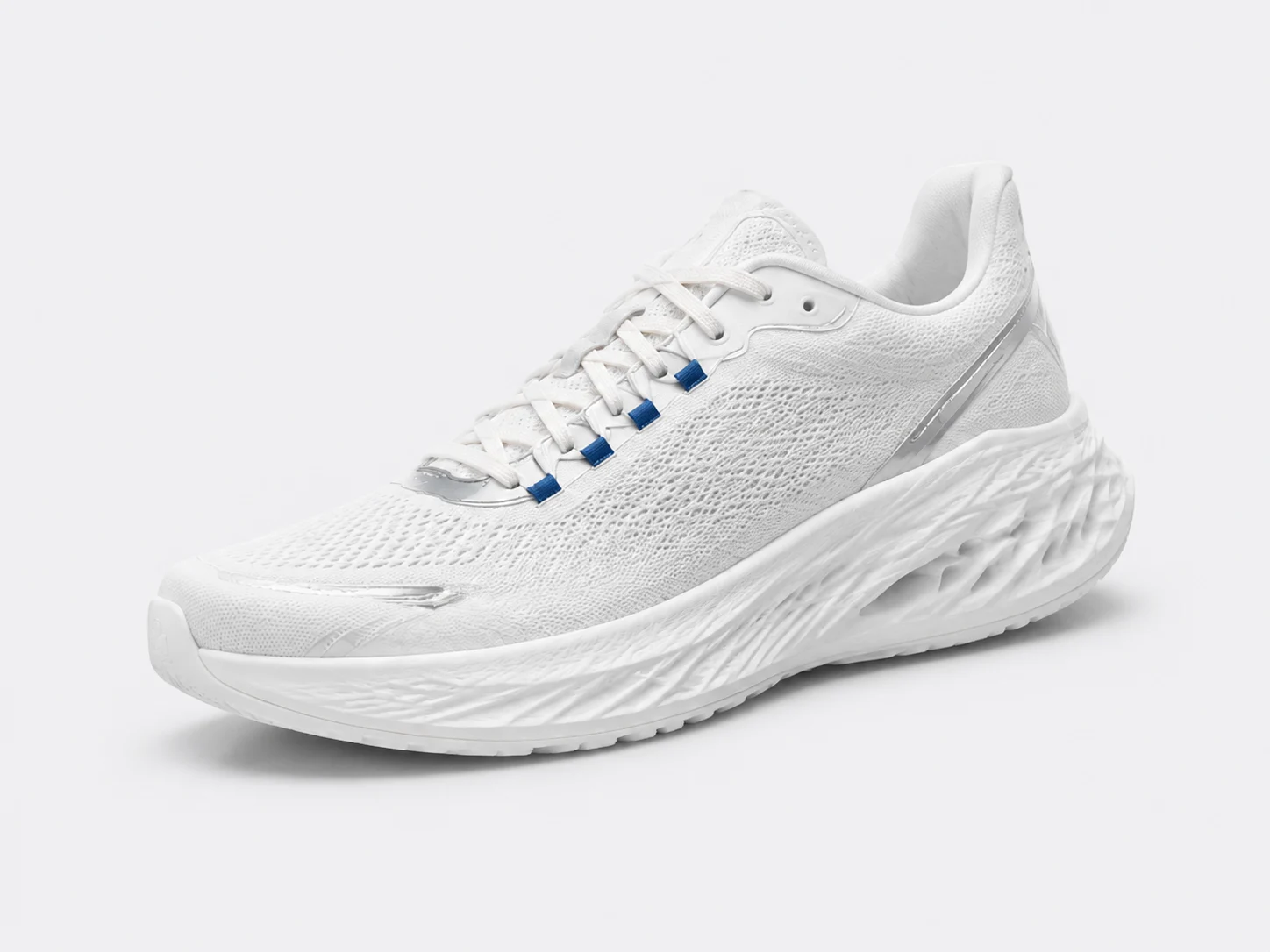
There is no price, brand story or evidence of comfort here. So the briefs do not claim all-day comfort or technical cushioning. They work with what is visible: white mesh, silver trims, four blue lace loops and a sculpted sole.
Each draft gets one job. A shows the design. B makes a memorable theme from the lace. C puts the shoe into an everyday outfit context. All start as square images without text, so product fidelity, headlines and typography do not become one tangled task.
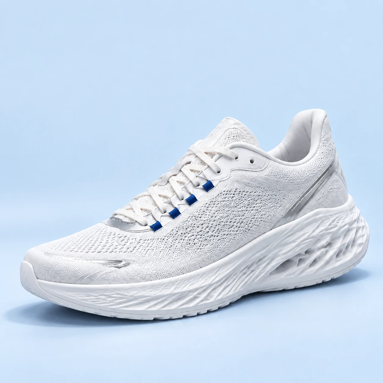
A: the simplest draft makes the changes easier to spot
 Enlarge image
The brief is modest: keep the orientation, use a pale-blue studio setting, show the whole shoe and leave headline space above. The output is clear, and all four blue loops are countable. I would take this into typography first because there is no additional story to explain.
Clear does not mean unchanged. Beside the source, the front of the toe has a more pronounced upright bumper with a faint embossed mark. The mesh and sole textures are not exact copies either. Asking to preserve the product did not remove the need to inspect it. A real seller would check the bumper and mark against actual photos before approving anything.
A headline worth trying is “White. With a little blue.” It comes from a visible color combination. It is a proposed line for the next layout, not copy that has been tested with shoppers.
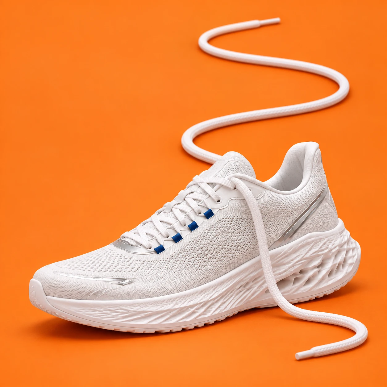
B: one path becomes two hard-to-follow lace sections
 Enlarge image
The concept starts with the product rather than a decorative setting. A shoe already has a lace, and a path relates to walking. Could that one existing part carry the idea without mountains, wings or more props?
The actual brief asked for one lace emerging naturally from an eyelet and forming an S-shaped path on the floor. The output shows an end hanging from the shoe into the foreground. The upper path starts behind the tongue. That does not prove it is physically disconnected, but the viewer has to guess how the two sections join.
I would rather not ask a shopper to solve a lacing puzzle. The revision therefore keeps the color and avoids adding a headline. Its one conceptual job is to expose the connection between the eyelet and the path.
First revision: expose the connection
Remove the long lace crossing the visible side and curling into the lower-right foreground. Reconstruct the exposed mesh and floor. Route one lace from the visible upper eyelet into open orange space to the left, then upward as a winding path. Keep the eyelet-to-floor transition visible. Preserve the orange setting and shoe position and size; use the original reference to check the four blue lace loops, silver trims and sole. Add no text or new props.
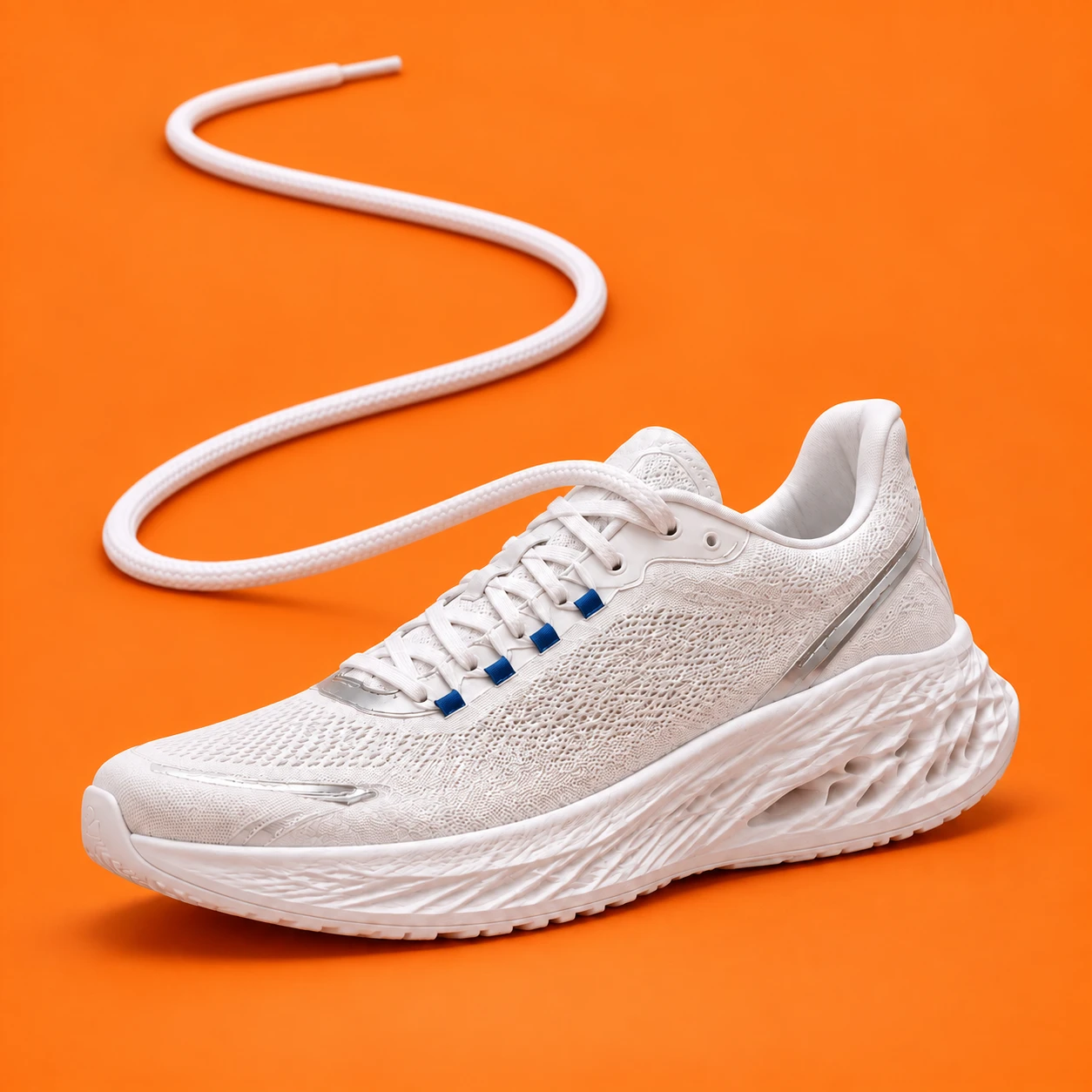
B1 · Before
Enlarge imageB2 · Connection fixed, material wrong
 Enlarge image
You can now follow the lace from the eyelet to the end at the top. The extra foreground section is gone. That was why I initially retained B2 instead of B1. But concentrating on the connection missed another product detail.
The earlier article called the extension thick and cord-like. That was not precise enough: the shoe has flat laces, while the extension became a round cord. This is not a stylistic choice about thickness. The same component changed form, so B2 cannot be treated as the corrected version.
This does not establish exact product preservation. The revision received both the orange draft and the original product reference; the shoe still needs checking. The download includes the complete English prompts and the input files for each call. The shorter instruction above is a summary, not the verbatim prompt.
Second revision: a flat lace must stay flat
This edit receives B2 and the original shoe again. The request changes only the extension: match the shoe's flat white woven lace, with a planar face, two clear edges and very little thickness. The eyelet junction must not become a round connector. Preserve the S-shaped route, shoe position and orange setting.
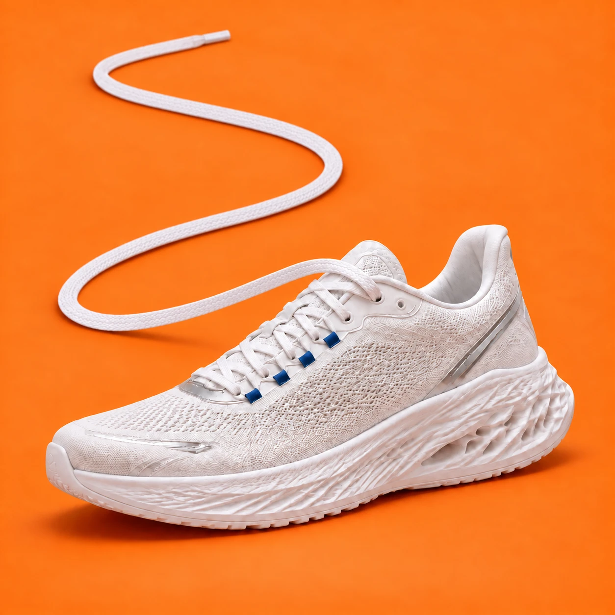
B2 · Error: a round cord
Enlarge imageB3 · Revised: flat woven lace
 Enlarge image
The new ground section has a broad planar face and a thin edge, with less of the earlier inflated cord volume. I would continue layout work with B3 rather than B2. This corrects the lace shape, not every detail of the shoe; product checks and headline placement are still outstanding.
The useful review question is more specific than asking for another image: as you follow it from the shoe to its end, is it still the same kind of lace? A component must retain its shape and material, not just connect.
C: try it with denim before inventing a model
 Enlarge image
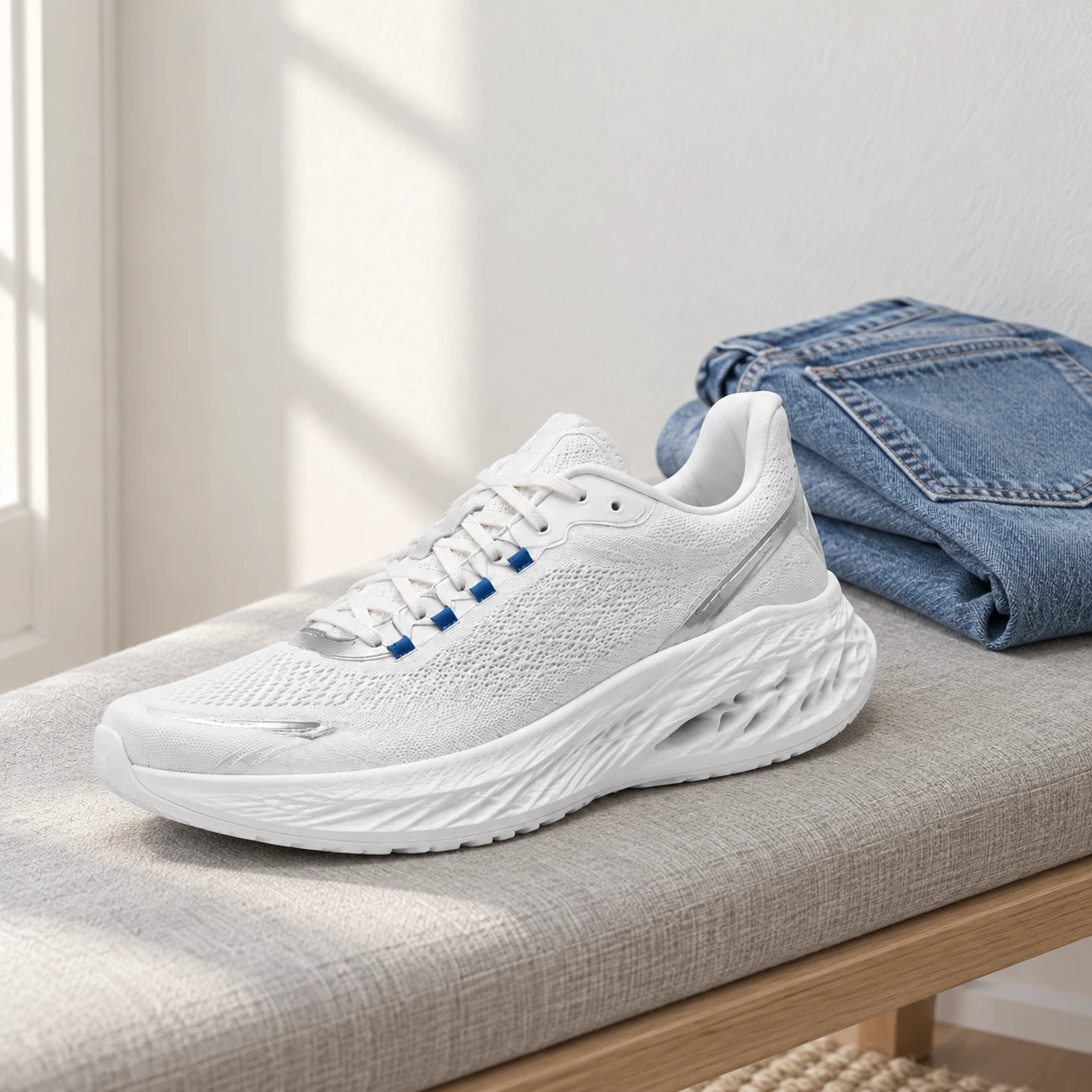
This version puts the same single shoe on an entryway bench beside folded jeans. Why not start with a person wearing it? We only have this angle of one shoe. Its opposite side is unknown. Asking for a pair on feet would introduce more details that we cannot check.
The still life asks a smaller question: how does the white-and-blue design feel beside denim? The jeans do not hide the product, and the textures and morning light suggest getting ready to leave. It is less striking than B, but the everyday context takes little explanation.
I would keep it as a styling candidate, not evidence of fit. The jeans are a prop, not a gift, and the real scale between shoe and trousers is unverified. To show how this SKU looks on a foot, the useful next input is an actual on-foot photograph, not another living-room background.
What stays, and what goes into the next brief?
With only one image moving into typography now, I would start with A. For a memorable concept to develop, I would keep B3 with its corrected flat lace. For everyday styling content, C is worth continuing. They answer different questions rather than competing for one best-looking slot.
- A · Develop layout
- Keep the clear product presentation. Check the changed toe bumper and faint mark, then try the color-led headline. Not cleared for publication.
- B1 · Do not continue
- Retain as process evidence. The foreground lace hides the product and the rear path connection is unclear.
- B2 · Error comparison
- The connection improved, but a flat lace became a round cord. Retain as process evidence, not the current candidate.
- B3 · Current candidate
- The extension is flat woven lace again. Check the junction, other product details and headline placement; not cleared for publication.
- C · Keep as candidate
- The styling context reads clearly. Verify product and prop scale; do not treat it as evidence of fit or comfort.
This round ends at text-free visual drafts. Final headlines, ad copy, the product landing page and actual placement previews are still outstanding. Nothing has run as an ad. Starting with A is a production decision, not a prediction that it will have the highest click-through rate. The useful output is three directions and a record of exactly what needs work.
Inspect the files, then brief your own product
ZIP, about 9.4 MB: one AI reference image, five unretouched PNG outputs (including B1, B2 and B3), exact English prompts, bilingual notes and the review record. No registration. These are study materials, not verified, ready-to-run assets for a real product.
Inspect B1, B2 and B3 rather than relying only on this account. Each first draft received the same single reference. B2 received B1 plus that reference; B3 received B2 plus the reference. These five calls had no hidden alternatives, and no later compositing replaced the shoe. The archive retains the actual outputs; website copies were only converted to WebP. Repeating the prompts can produce different results.
The useful thing to borrow is one job per draft, not the orange. The worksheet below is an adaptation template for your product, not the original call text.
Product and intended shopper: References: actual SKU photos and verifiable packaging or details Keep unchanged: color, structure, marks and included accessories Confirmed features we may communicate: A / Show the design: one visible detail, no unsupported performance B / Make a memorable theme: start with an actual part or use C / Imagine the context: plausible styling or setting, no implied free accessories Make text-free drafts first; set headlines separately For each output: what reads clearly, what is wrong, what should the next edit change? Missing evidence or questions we cannot answer yet:
- With only one angle, start with a composition you can check rather than inventing the unseen side.
- Build the idea from the product without hiding it or suggesting unsupported features.
- Keep the before and after. The reusable asset is also the reason for making the edit.
Key takeaways
- All three drafts start from one reference; the message changes, not just the background.
- A connection is not enough: flat laces on the shoe must not become a round cord outside it.
- Inspect the actual files and prompts yourself. This is a production study, not a performance claim.
Take one product photo whose details you can verify, explore three messages, and write a specific decision for each output. The goal is not three polished winners; it is knowing which direction to develop and exactly what to change next.