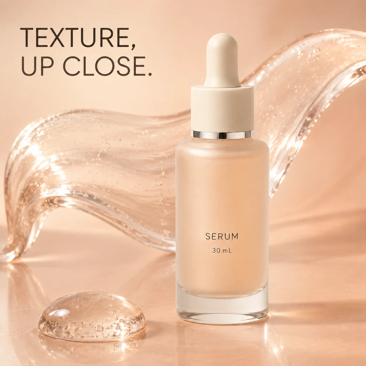
“Make it premium, like an international brand.” Easy to write, but marble, a metal plinth and bathroom daylight could all fit that description. Without saying what you want the shopper to think about, it is hard to call any of those directions wrong.
Separate what stays from what you can explore
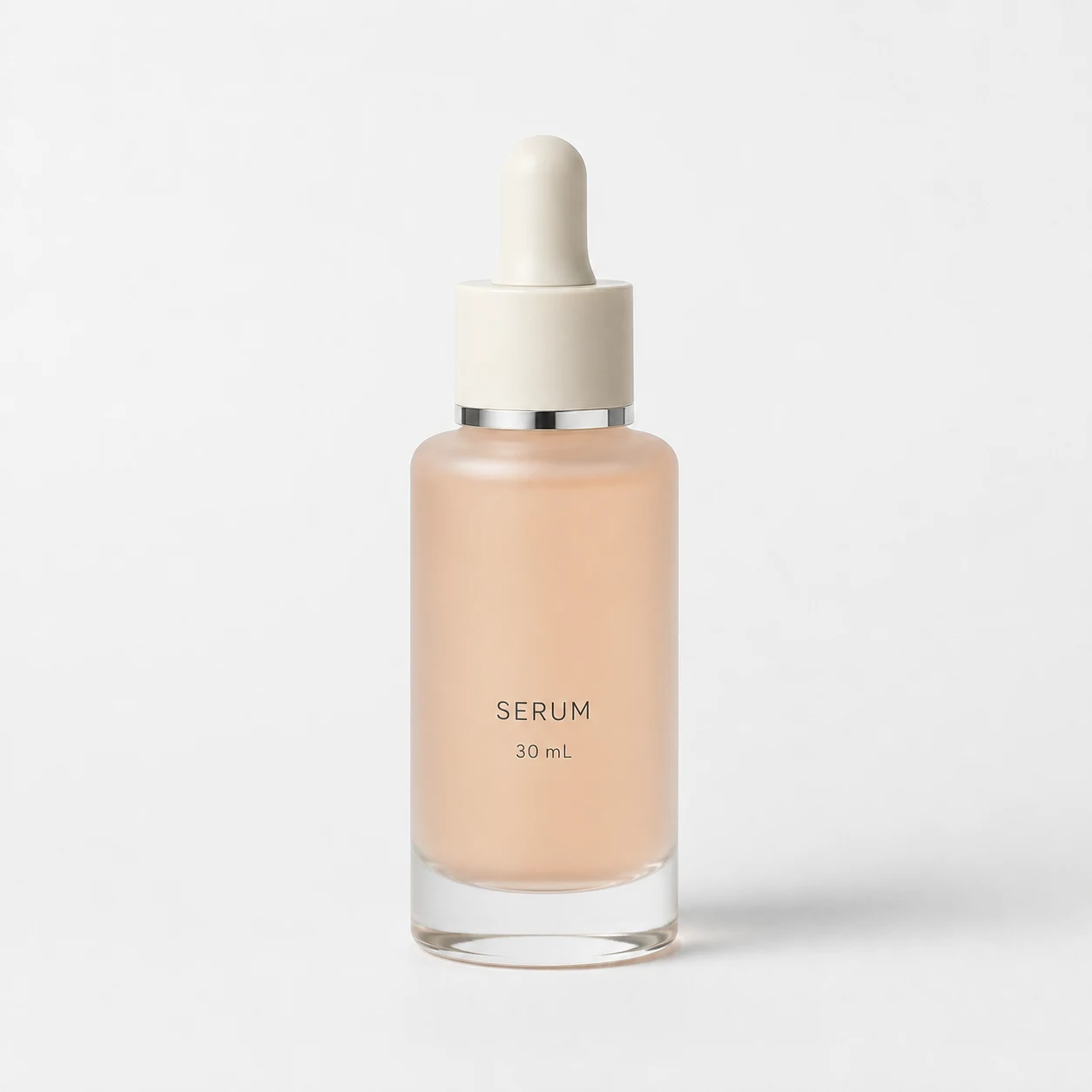
For this serum, the bottle shape, ivory dropper, silver ring and label are product information. The tray, light and background are creative choices. Put everything under “be creative” and the product may change with the setting.
Supply clear real photos and accurate packaging text for your own item. If the back is missing, add a back view. If the volume is unreadable, state it rather than asking AI to guess. A peach-colored bottle does not mean peach is an ingredient; a ring of fruit would introduce a different message.
Finish one sentence before choosing the props
I would start with: for someone browsing Instagram, suggest taking a small moment for skincare in the morning. Bathroom daylight now has a reason to be there. A black racing car or a dramatic splash does not, at least for this direction.
Then make three decisions: the bottle must be recognizable, the props only need to suggest morning, and the headline needs quiet space. Add the product details that cannot change. More words are not automatically better; each instruction should have a reason to be there.
- Destination: choose the use and placement before the aspect ratio.
- One thought: a morning moment or a texture study, not everything at once.
- Review: check whether the bottle is blocked, the props compete or the headline has nowhere to go.
Work backward from this picture
 Enlarge image
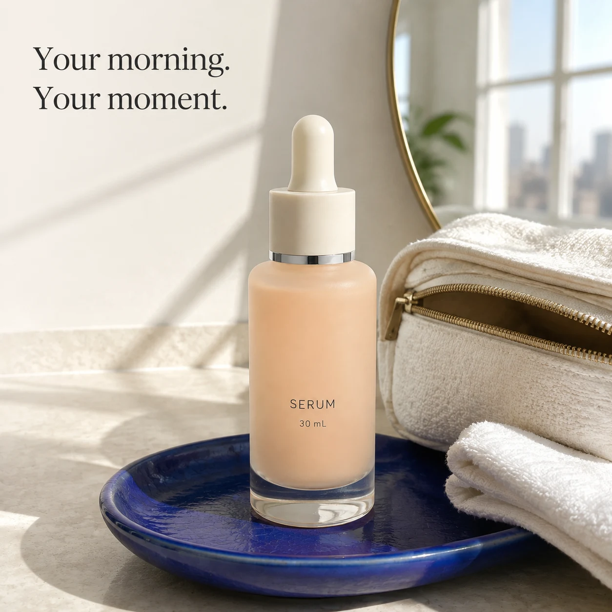
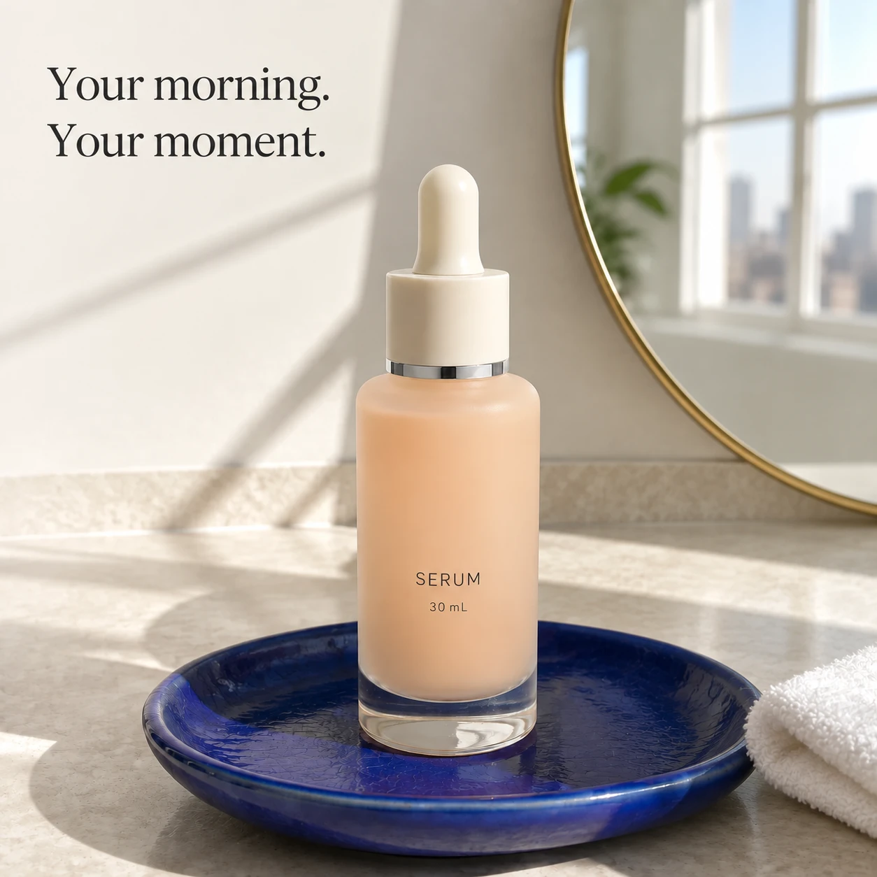
The useful instructions are more concrete than “premium”: a deep blue tray under a pale bottle, towels and a mirror to suggest a wash space, window shadows to suggest morning. The wash bag on the right occupies quite a lot of space too. It is optional scenery, not an automatic improvement.
Product: use my real photos. Preserve the bottle, dropper, neck ring and label. Destination: Instagram feed; start with a square composition exercise and adapt it to the actual placement before publishing. Message: a small moment for skincare in the morning, without unverified efficacy claims. Scene: the complete bottle on a deep blue ceramic tray, one towel and natural window light. Props must not cover the bottle. Text: leave room for a short headline at the upper left. Create the scene without extra headline text, then set it separately. Do not alter the product's existing label. Exclude: extra caps, guessed ingredients, sales figures and certification marks.
Revise the problem, not the entire brief
This time we went beyond advice. We submitted the existing image to an image-editing tool, asking it to remove the wash bag and reduce the towels while retaining the rest. The request below summarizes the instruction actually used for this edit, rather than the reverse-written initial brief above.
Keep the square composition, morning light, camera angle, mirror, window and deep blue tray. Remove the whole wash bag on the right and the large towel above it. Leave only a small foreground towel corner at the far right, restoring the counter and wall naturally. Preserve the bottle position, proportions, dropper, silver ring and label as closely as possible. Keep Your morning. Your moment. and SERUM / 30 mL unchanged. Add no products or props. Return one edited image, not a before-and-after collage.
Before
Enlarge imageActual edited output
 Enlarge image
The clearest change is the open space on the right. The bag is gone, the towel moves to the edge, and another large bright object no longer crowds the bottle. This addresses competing props; it does not establish a higher click-through rate.
But “keep everything else” was not followed pixel for pixel. The tray texture and bottle highlights also changed, and more of the mirror's edge is now visible. I would keep the fewer-props direction, then check the product against real references rather than call this a fidelity-approved deliverable.
The next request need not reopen the whole style. If the mirror competes too much, address the mirror. If packaging must be exact, check it against real artwork during retouching. Specific feedback lets us see both what changed and what remains unresolved.
Key takeaways
- Say what the shopper should think about before choosing the light and setting.
- Supply visible reference details separately from verified product facts.
- In a revision, name what stays and what changes so you can check the result.
Before writing “make it more premium,” name one thing worth keeping and one specific thing getting in the way of the message.